The Melbourne University Law Review Committee has a very strict referencing system. Correct referencing is an essential legal skill and technique. A group of diligent students thought they could try to find a digital solution to the traditional book referencing system. So, they came up to us for help in automating a dynamic referencing system they had conceived. One that could maintain the correct formats and save old references for future uses.
THE CHALLENGE
To all for a seamless automation of legal referencing for users and storing bibliographies with multi user level access.
We needed to have the ability to export references to PDF maintaining appropriate formatting with back end functionality for multiple levels of approval for references and generating different bibliography styles. Lastly, we needed the ability to categorize the references into set categories and create new ones while archiving references and be able to browse through them.
THE STRATEGY
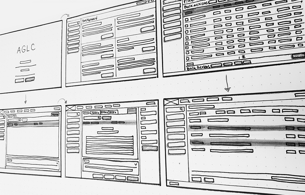
We generated individual prototypes for both front and back end. The back-end planning was most important since it involved a multi-level approval system for references, user registration, approval and assignment of hierarchy levels. We generated different management sections for users and references where the administrator could approve references to move up or down in the reference pools, user permissions, styles and bibliography styles freely.
On the front end, accessing all the elements at the same time would be too overwhelming, so we suggested a ’hide function” so users could make items visible or hidden depending on their needs. This way they could choose to have full screen view of their workflow.
Finally, we generated a new brand identity to launch the site. We wanted to provide the brand with a sleek and modern look to show how this app breaks the old traditions and provides home to new ones. For this stage we used the style guide of Melbourne University however, provided a modern spin for the brandmark and typography. Since the screens are so content heavy, we kept the elements simple and minimal, letting the information take the spotlight and not allowing for any distractions.
THE OUTCOMES
Upon launch, the application was very well received and it saved students a lot of time and stress. All their references were done properly and a database has started to build up.

Brandmark Design

Website Design Demo
Website Front-End

AGLC Front-End


